This essay was written as a university assignment whilst studying at Bath Spa University. It is not written to be read on the web, but I have adapted it to work as best it can on here. If you want all the references and a bunch more images, check out the original version as a PDF.
Movements in graphic design – like movements in fine art, cinema, or music – are primarily dictated not by personality, or society, but by technology. The freedom brought by digital printing led to the spirited experimentation of Postmodernism just as the freedom brought by digital filmmaking lead to Dogme 95’s experiments in cinema. So what happens when a medium arrives that, technologically speaking, starts back at nothing? Is its visual feel dictated by other movements in other, more technologically advanced media, or does it allow its own technological advancements to shape its aesthetic?
In the case of web design, its change from what was essentially the hacking of HTML tables, to a respected, profitable sub-industry of design has been so rapid, and its trends so defined, that the impact of technology upon it has been easy to chart. And although web designers have flirted with Postmodernism, particularly earlier on in web design’s history, they seem to have settled upon a new, digital form of Modernism as the true “voice” of the web.
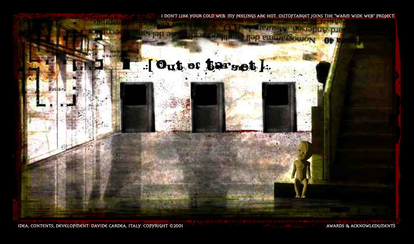
It is interesting to note that web design’s visual development corresponds, for the most part, with its technological advancements, although Postmodernism’s early rise in web design is a notable outlier here. Postmodernism’s emergence came with the popularity of Flash-based websites: No longer was web design accessible only to those who knew how to code, but instead, a website could be manufactured by any designer capable of using Flash. This, along with the promise of the Dot-com bubble growth, brought an influx of graphic designers from other fields, which at the time (late 1990s–early 2000s) were dominated by Postmodernist designs and the “grunge” aesthetic – an aesthetic that quickly made its way onto the web.
However, as web standards evolved and HTML & CSS capabilities improved, Flash grew out of fashion, to the point that it is now considered a “dirty word” and a sign of amateurship within the modern web community. Many would argue it is wrong to even classify Flash websites as web design, as it was simply placing another technology within a browser frame, but it played such a large role within the evolution of web design that it is impossible to simply overlook.
Whilst in graphic design, the insanity of Postmodernism came as a reaction against the rigidity of Modernism, the reverse is true in web design: The insanity of early, Postmodernist Flash sites led to web designers reacting against this and returning to a more Modernist aesthetic as the web progressed. Unlike the Postmodernist aesthetic on the web, however, the Modernist look was less defined as such: It is difficult to ascertain to what extent web designers purposefully drew from Modernism and to what extent it was simply a case of a similar aesthetic emerging from a similar technological state. Whether the intent was there or not is ultimately irrelevant, however, as there is no doubt that the underlying, unwritten principles of the web are distinctly Modernist.
The Victoria & Albert Museum defines the key principles of Modernism succinctly:
A rejection of history and applied ornament; a preference for abstraction; and a belief that design and technology could transform society.
These ideas are becoming increasingly apparent in the web, particularly with the emergence of the “flat design” trend. This “trend” (the term preferred by the web community, as “movement” implies a longer timeframe which a fast-moving web cannot accommodate), was a definite reaction against the strong textures and shiny skeuomorphs that preceded it, eschewing these textures (“applied ornament”) in place of strong, flat colours and clean typography.
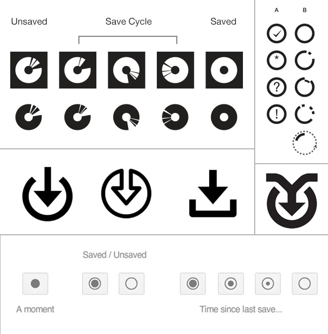
This sea-change in aesthetic made many question other aspects of web design, such as iconography: One particular discussion that caught the web’s attention was the idea of a new Save icon, the argument being that floppy disks would mean nothing to newer generations, and that a new, abstract metaphor should be adopted by the web at large - Arrows, circles, fragmented circles, and arrows within fragmented circles were the solutions most discussed. Of course, as is often the case, the debate was ultimately fruitless, but it nevertheless demonstrates an approach within the community that favours abstraction over skeuomorphs and direct metaphors.
The belief that design and technology can change society, whilst present in the web design industry, seems to have grown less organically than the other aspects of Modernism within web design, but has rather been directly inspired by Modernist writers and thinkers. In a talk at Build Conference, Wilson Miner puts the writing of Marshall McLuhan (arguably a Modernist writer, albeit a late one) in the context of web design:
You know what we get to do when we leave here? We get to go make things. Things that nudge the world a little bit in what we hope is the right direction. We get to put a dent in the universe.
This talk, seen over 74,000 times on Vimeo, seems to have resonated around the internet, and since, similar sentiments have emerged in writing around the web. Frank Chimero writes:
Things are starting to suck, but there’s a capacity for change in what we’ve made, who we are, and what we believe. Everything was made, and if we want, we can remake it how we see fit.
But although a very explicit Modernist aesthetic, and indeed mindset, has been present in web design in the past few years, its presence has always been, to an extent, felt across the web, for a number of reasons. Chronologically, the first of these was perhaps typography: prior to the arrival of fast and secure font-embedding technologies in the web (@font-face, Typekit, Google Fonts) in the past few years, the only fonts that designers could use on websites were those that the user would have on their computer. With different platforms being loaded with different fonts, the selection of “web-safe fonts” was extremely limited: Arial, Comic Sans, Courier New, Georgia, Impact, Times New Roman, Trebuchet and Verdana and Webdings were the only fonts truly accessible on all devices. Because of this limited selection, and the popularity that Helvetica already held, Arial, for a long time, dominated the web, just as its father, Helvetica, dominated Modernist graphic design. Of course, it is wrong to equate Helvetica and Arial (Erik Spiekermann describes Helvetica as “perfect” whilst Arial is simply “pollution”) but nevertheless, it is certainly true that neo-grotesque sans-serifs have been the predominant typographic voices of both web design and Modernist graphic design. With the emergence of a greater variety of typographic choice on the web, many designers have attempted to escape the ubiquity of Arial, to the point where it is now rare to encounter it in a well-designed contemporary website.
Certainly one of the defining characteristics of Modernism is its colour palette: Vivid, often primary colours, paired with off-whites and blacks were prevalent throughout all stages of Modernism, and its rigidity when it came to colour, largely driven by cost of printing, has lent the aesthetic an air of timelessness which newer, less-constrained aesthetics had not. Web design, for the most part, has been similarly reserved in its colour usage, initially due to technical constraints. With early 8-bit screens capable of displaying just 256 colours, but not each screen the same 256 colours, a palette of 216 “web-safe” colours was devised, that designers were encouraged to use. Furthermore, on 16-bit screens, it was found that many of these colours were mapped differently, and so David Lehn and Hadley Stern developed a set of 22 “really safe” colours, which, for optimal page-load speed, it was advised that web designers use. This palette, which consisted primarily of blues and greens, and but a single red, may have dictated early web design colour schemes.
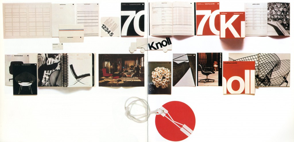
Today’s computers, however, are capable of handling 16,777,216 colours, and so designers have no such issue. But still, most designers use limited palettes on the web. Is this a trait carried forward from Modernism, a remnant of the computer’s past, or simply an adherence to commonly-taught colour theory? Whilst this is unclear, a recent development is sites such as Flat UI Colors, which attempts to pare down the palette even further, creating what is almost a strict uniform for design. This idea of self-inflicted constraints feels intrinsically Modernist: Massimo Vignelli, throughout his career, attempted to establish unique brands (Knoll, JCPenney, Heller) using white, beige, black, his own “Vignelli Red”, and Helvetica.
This ethos of constraint has permeated both Modernist design and web design, although for seemingly different reasons: The Modernist designers were constrained not by choice: type was costly and Helvetica was plentiful, and to use one colour was cheaper than to use two. In the case of web design, it seems that these constraints are self-afflicted: perhaps as a means of justifying the reams of constraints already brought by the medium - By keeping web design simple, you hide the inadequacies of the technologies. That said, there is a strong argument to be made that constraints simply make for better designs. As Jason Fried puts it:
Constraints drive innovation and force focus. Instead of trying to remove them, use them to your advantage.
The odd-one-out in this argument, however, is a favourite of both the Modernist and web aesthetics: grids. For Modernists, grids were absolutely self-afflicted - Josef Müller-Brockmann outlined their role within design as such:
The use of the grid system implies
the will to systemize, to clarify
the will to penetrate to the essentials, to concentrate
the will to cultivate objectivity instead of subjectivity
the will to rationalize the creative and technical production processes.
This near-fetishisation of grids is also present in web design: Mark Boulton says of them:
Well designed grid systems can make your designs not only more beautiful and legible, but more usable.
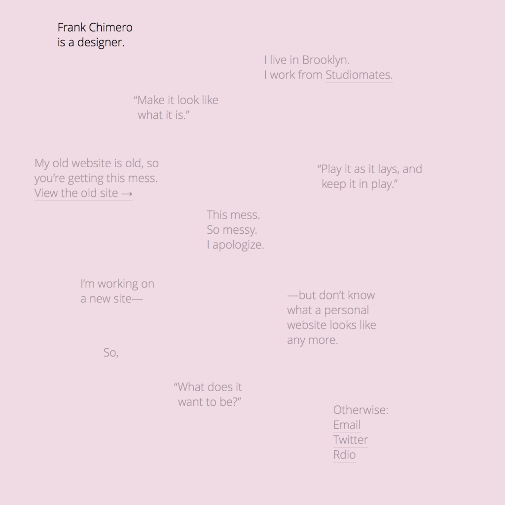
However, the adoption of grids as a constraint within web design is really one brought by the technology, in that it is far easier to design a website that conforms to a grid than one that does not. The ubiquity of grids within web design has gotten to a point, in fact, that sites that purposefully break out of the grid, such as Frank Chimero’s personal website, are praised for their originality. Due to the technology, however, certain grid styles are not possible, such as radial or diagonal grids, seen throughout Müller-Brockmann’s – and many other Modernist designers’ – work.
But it is easy to draw comparisons between two aesthetics and conclude that one has taken from the other – the human mind is designed to make connections, and so any two aesthetics, even if in no way connected, will have visual links. What is perhaps more important is intent, and what effect it serves. As nowadays, design seems to centre around trends, rather than movements (which are more formal, and better defined,) it is significantly harder to determine intent. However, Curt Cloninger sees the change back to a Modernist aesthetic to be a reaction against Postmodernism:
Fast-forward again to the late 1990s, and a new genre of designers arise who are bored with the anarchy of postmodern design. They seek to reclaim the beauty and intention of Swiss modernism, but playfully, without all of its quasi-religious regulations and inhibitions.
Cloninger does not refer to the web specifically, but certainly, at that time, the web was a rapidly-growing medium with a low barrier-to-entry, and so it is inevitable that these young designers would adopt the web as their playground: A breeding ground for this new brand of “Postpostmodernism” to flourish and grow.
Does it matter to the user if these designers have purposefully pulled from the Modernist aesthetics? Of course not. But the principles that made Modernist designs usable – semantically structured content, clear hierarchy, striking colours, and legible text – will make today’s websites just as usable. And that is what will matter to the user.